Albrecht
MES BLOGS
-
Artifex in opere
http://artifexinopere.com/
Le plaisir des tableaux, les détails à la loupe, le jeu des sur-interprétations.
DERNIERS ARTICLES (644)
-
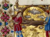
7.2 Présomptions
Avant de revenir de manière détaillée à la gravure, nous allons prendre un peu de recul et présenter les idées générales qu'un esprit cultivé, tel que Dürer,... Lire la suite
Publié le 16 février 2018 BEAUX ARTS, CULTURE, EXPOS & MUSÉES -
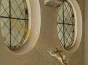
7.3 A Noir
Puisque l'Oeuvre au Noir était notoirement connue comme pénible et décourageante, il serait logique que Dürer ait étendu à l'alchimie sa réflexion sur les... Lire la suite
Publié le 16 février 2018 BEAUX ARTS, CULTURE, EXPOS & MUSÉES -
7.5 Le Régule Martial Etoilé

Le lecteur intéressé trouvera ici une interprétation alchimique de la partie droite de la gravure, ainsi qu'une explication de deux curiosités : la... Lire la suite
Publié le 16 février 2018 BEAUX ARTS, CULTURE, EXPOS & MUSÉES -
La cage hollandaise
La cage à oiseaux signale bien souvent, dans la peinture hollandaise, un lieu ou une scène de débauche (du verbe vogelen, copuler , formé sur le mot vogel :... Lire la suite
Publié le 15 février 2018 BEAUX ARTS, CULTURE, EXPOS & MUSÉES -
Les pendants d’histoire : l’âge classique : Poussin
Grand théoricien de la composition, Poussin est certainement celui qui a poussé le plus loin l’esthétique du pendant classique. Lire la suite
Publié le 24 janvier 2018 BEAUX ARTS, CULTURE, EXPOS & MUSÉES -
Loth et ses filles
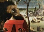
Ce très célèbre tableau, autrefois attribué à Lucas de Leyde, combine deux épisodes consécutifs du texte de la Genèse. Anonyme anversois, vers 1525-1530,... Lire la suite
Publié le 27 décembre 2017 BEAUX ARTS, CULTURE, EXPOS & MUSÉES -
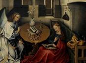
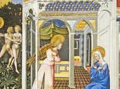
5.3 L’Annonciation du Prado
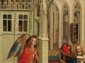
Nous allons terminer cette longue étude par un dernier mystère, que nous laisserons irrésolu : qui a peint et quand la troisième Annonciation de... Lire la suite
Publié le 03 décembre 2017 BEAUX ARTS, CULTURE, EXPOS & MUSÉES -
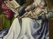
5.2 Une Histoire en quatre tableaux
Nous pouvons maintenant rentrer dans l'atelier de Joseph, et déguster son assortiment de métaphores. Lire la suite
Publié le 03 décembre 2017 BEAUX ARTS, CULTURE, EXPOS & MUSÉES -
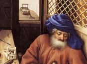
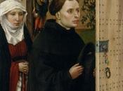
- La chaleur de Joseph
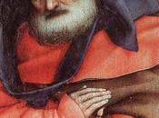
Dans la plupart des Nativités, Joseph ne fait pas grand chose : il s’agenouille devant l’Enfant Jésus ou bien, fatigué, il se repose sur son bâton. On examine... Lire la suite
Publié le 02 décembre 2017 BEAUX ARTS, CULTURE, EXPOS & MUSÉES -
- Symbolique du Fer et du Bois au Moyen-Age
Voici ce que Michel Pastoureau [1] nous dit de ces deux matériaux, et de leur opposition. Le bois Lettre A Graduel,Getty Museum, Malibu « Pour la culture... Lire la suite
Publié le 30 novembre 2017 BEAUX ARTS, CULTURE, EXPOS & MUSÉES -
5.1 Mise en scène d’un Mystère sacré
Les intuitions d’Arasse Daniel Arasse avait en main, dans son article de 1976 [1] tous les éléments de la solution complète du puzzle, et notamment de la... Lire la suite
Publié le 30 novembre 2017 BEAUX ARTS, CULTURE, EXPOS & MUSÉES -
4.6 L’énigme de la bougie qui fume
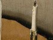
Une interprétation originale de la bougie qui fume... Lire la suite
Publié le 30 novembre 2017 BEAUX ARTS, CULTURE, EXPOS & MUSÉES -
4.5 Annonciation et Incarnation comparées
Nous voici maintenant à même de proposer une interprétation complète du panneau central du retable de Mérode Lire la suite
Publié le 30 novembre 2017 BEAUX ARTS, CULTURE, EXPOS & MUSÉES -
4.4 Derniers instants de l’Ancien Testament
Munis d’une interprétation d’ensemble du panneau de Bruxelles (4.3 Premiers instants du Nouveau Testament), nous allons maintenant voir si elle... Lire la suite
Publié le 29 novembre 2017 BEAUX ARTS, CULTURE, EXPOS & MUSÉES -
4.3 Premiers instants du Nouveau Testament
Nous sommes donc à l'instant précis du basculement entre l'Ere sous la Loi et L'Ere sous la Grâce. Lire la suite
Publié le 29 novembre 2017 BEAUX ARTS, CULTURE, EXPOS & MUSÉES -
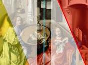
4.2 L’Annonciation de Bruxelles
Commençons par une description des différences entre le panneau central du retable de Mérode et l’Annonciation de Bruxelles, en suivant le catalogue du... Lire la suite
Publié le 29 novembre 2017 BEAUX ARTS, CULTURE, EXPOS & MUSÉES -
4.1 Une interprétation élémentaire
Nous allons nous essayer à une première approche d’ensemble du retable de Mérode, dans une approche originale : celle des Quatre Eléments. Lire la suite
Publié le 28 novembre 2017 BEAUX ARTS, CULTURE, EXPOS & MUSÉES -
3.3 L’énigme de la planche à trous
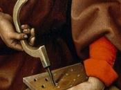
La planche à trous de Joseph a donné du fil à retordre à trois générations d'historiens d'art. Lire la suite
Publié le 28 novembre 2017 BEAUX ARTS, CULTURE, EXPOS & MUSÉES -
3.2 Joseph second rôle
Pour faire sentir à quel point l’iconographie du retable de Mérode est complexe et exceptionnelle, nous allons parcourir les très rares exemples ou un... Lire la suite
Publié le 27 novembre 2017 BEAUX ARTS, CULTURE, EXPOS & MUSÉES -
3.1 Une élaboration progressive
Un fait incontournable : le triptyque de Mérode n’a pas été conçu comme un tout, mais en trois étapes. Un certain manque de cohérence Des points de vue... Lire la suite
Publié le 27 novembre 2017 BEAUX ARTS, CULTURE, EXPOS & MUSÉES
LES COMMUNAUTÉS

LES JEUX SUR PAPERBLOG.FR
-
 Jeu de briques
Ce jeu de briques a été conçu en 1985 par Alexei...... Jouez -
 Snake
Snake
Snake, de l'anglais signifiant « serpent », est...... Jouez -
 Pacman
Pac-Man est un jeu vidéo créé en 1979 par le...... Jouez -
 Bubble
Puzzle Bobble aussi appelée Bust-a-Move en...... Jouez